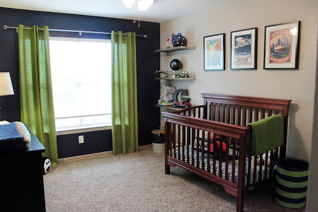
When it came time to think about Grant's nursery and how I wanted his space to look, I knew I wanted something classic, (and like Everleigh's room...nothing too "baby"), that he could grow into. I wanted something we would ALL enjoy for years to come even after he transitioned into a big boy room, (cause Lord knows this mama would surely NOT have the energy needed to try and do a whole new room makeover in a few years. ;)
Unlike Everleigh's room though...where we just went with a color scheme that I liked and thought would be fun for her, Grant's room had a more focused, theme oriented feel to it. Playing off a traditional "boy's room", we went with a transportation theme with a vintage twist. Navy blue, lime-y green with pops of orange here and there. I still have plans to incorporate orange into his crib skirt and/or rail guard, so needless to say, this room is NOT 100% done yet but I'm actually quite PROUD of where it stands today, considering we still have a little over 6 weeks til baby is due to make his arrival.
Slowly but surely... here is where baby boy's room stands today. :)
Grant's Room - AFTER (in progress)
Grant's Room - Previous Owner's Decor
Certainly has come A LOOOOOOONG way from how we saw it when we purchased our house a year and a half ago!
Grant's Room BEFORE - How it looked a month or two ago
A mess to say the least! Yikes :)
For awhile there I had contemplated these orange curtains (which was actually a duvet cover that I took apart and sewed a lining onto) but I ended up liking how the solid green seemed less busy AND was a lot less work to put together...lol. At nearly 30 weeks pregnant (at the time), I quickly found out how UN-motivated I was to work on the other panel after spending hours trying to get these stupid things to line up properly. It probably would've been easier to work on everything on the floor but I ended up working on our very large but also very SLIPPERY dining room table. NOT a fun process so I quickly decided that the green would win the curtain contest...for now. I figured if I ever wanted to change the look of the room, I could easily finish up that other curtain panel later on.
While perusing Pinterest for inspiration, we came upon this awesome shelving idea that took Ikea brackets and stained deck boards to create this awesomely industrial-ish look we were going after.
Homegoods has definitely been the source for a lot of the decor for this space.
The piggy bank, the silver plane, both vintage cars, the metal G, and plane stool all came from Homegoods. The globe and dark navy basket were Ross finds. :) Gotta love me a great find!
The prints over the crib were just photos I found and printed off the internet. The frames came from Ikea.
And this cute "not-so-little" bear pictured above found ALL of her old baby things as we were organizing and decided that she needed to baby test everything again. ;)
Ohhhh the entertainment this kid brings to our lives.. :)
It was actually cute how Everleigh gave up one of her big bears for her baby brother's room. This giant panda had been living in our playroom for the last year and when I asked Everleigh if we could put it in Grant's room, she happily agreed and even helped me move him over!
Inspired by several projects I had seen on Pinterest (of course) I enlisted the help of my super awesomely HANDY husband to create this pegboard station above the changing table. It's obviously not filled up with all the decor I'm sure it'll eventually get, but I love how it looks so far. :)


